Here's my progress:

This is the initial working out of what fonts suit the idea in my head, whether there's enough type, how it all fits together... which eventually turns into this:

Which is actually a lot later in the piece when I remembered to take a photo of the forme.
Here's the initial proofs:

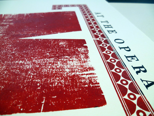
...and here is the final colour, a bit brighter than my initial mix:

I'm in love with this red, a mix of Warm Red and Rubine Red, and big snaps to the nice UniPrint people down the road who let me look at their Pantone swatch book for ideas, since I left mine at home. I'm also in love with the big wooden M, which is my attempt to evoke a faded but loved red velvet theatre curtain.

This is inking from my viewpoint, and this is another:

taken in action by Donald the Special Collections Librarian.
And here are the sexy shots:

Donald thought I might use this block to illustrate the word lorgnette, the central premise of the poem:
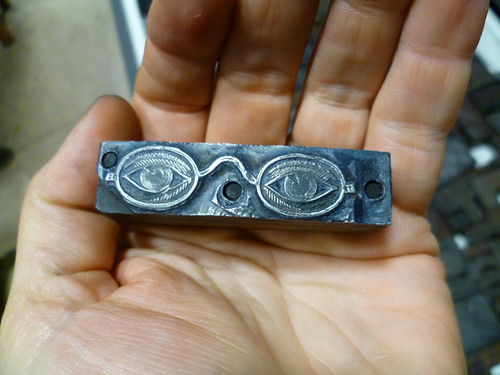
But I decided to keep everything typographical, keep away from the readymade images, and make people do what I suspect Les Murray wanted people to do: go and look up the word.
Also, when I was planning this image, I'd been thinking that the whole series would be portrait orientation, that is, taller than wider. But in the staffroom yesterday having morning tea, it struck me like a thunderclap that it would work much better in landscape. This now means that at least one other of the posters will have to be landscape too, or this one will stick out in the series like a sore thumb.
Speaking of sore thumbs, look what this work does to hands:

Broken nails, paper cuts, ripped cuticles, ink stains -- yes, that's the red ink Lady Macbeth look, and I do walk around the library rubbing my hands muttering 'out, damned spot', but I'm rubbing them with baby wipes, which rather undermines the drama.
My feet and legs hurt too, from so much standing. I discovered that there is a massage clinic at the local Polytechnic, and have written an email to them asking about availability. I've also discovered that my college has baths hidden away throughout the building, so I'm going to seek out the closest one and buy some epsom salts. It's hard to sleep from the aching of my muscles, but I'm hopefully toughening up a bit!
9 comments:
ooooo this is my fav so far
and its not just because you're tackling my fav poet (I actually based my first solo exhibition - a very calligraphic affair back in the mid 1990s - on Les Murray poems that I first fell for in high school - all stuff from 'the vernacular republic' LOVE 'EM)
nooo I think this is my fav because I'm seriously in love with that 'M'(seriously) and I love that red (really) and, ok, I'll be honest, I like to see that your willing to show how much you're suffering for the cause....
keep the fabbo posts coming - best read I've had in blog land in a long time
oh, that is so very beautiful!
Love it. You are so clever! That huge M is just wonderful.
A warm M and a welcoming M.
I think Lady Macbeth would have been thrilled with baby wipes. But she is not one for a lorgnette. That's more Lady Bracknell.
You know the best thing about you being away in Dunedin all by your lonesome, apart from the most splendidly beautiful pictures, is the fact that you are writing every day.
So good!
none of your readers need to look-up 'lorgnette'.
Did you see Griff Rhys-Jones learn to set antique type in one of those Great Cities shows recently screened?
He was hammering the actual letters used for some historic leaflets - French revolution or similar.
2.
Have just come from Boing Boing website where they link to Smithsonian special thing on old children's books (or similar - I have the retention of a canary being 60's acid-casualty)
Link to videos of old animated books
Great post, the M is perfect, the colour stunning and I feel privileged to be watching your progress step by step.
That's a great effect--I love the M, and it has a great look next to the crisp script. The lorgnette block would be very hard for me to resist, because it is so charming.
It does look exactly like a shimmery bit of soft, old, red velvet moving slightly in the warm air. Beautiful page.
Post a Comment