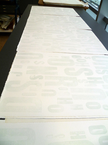
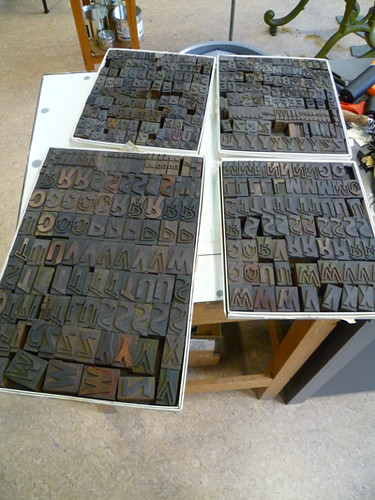
The folio cases are being made at the University Bindery this week. I've been overprinting all the poster images on a few sheets and they're going to be cut into strips and inlaid on the front of the cases. That's another reason why I love this place... they still have a university bindery.
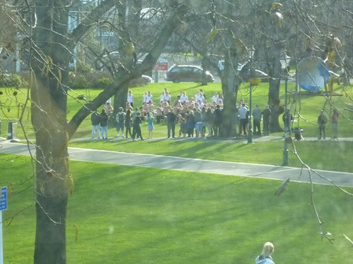
I'm lying on the couch in my flat, listening to the wind howling outside my window. We had a couple of beautiful days, quite warm with no rain, and then today the rain came back, the temperature dropped, and the wind started up. There might be snow, who knows? It doesn't bother me, I'm in t-shirts in the warm studio, looking out at the world through the big glass window. Last week I watched a line of children leaving the museum carrying sleeping bags, having just had a sleepover there. On Sunday I glanced out from my work and witnessed a Haka ritual:
Why do I need to go anywhere? But I do get out. I got some crazy op shop bargains, two colourful light merino jumpers (one red, one purple) for $8... one was $5, and the other was half price for $3! My feet have been killing me, so I went looking for some Crocs (fabulous for all-day standing on concrete, as I may have mentioned before, and much safer for clumsy sorts like me than tripping on rubber mats) and I found a pair for $6! Happy feet, happy Duck. Within half a day of wearing them, my feet stopped complaining. Bliss. I do only wear them in the studio, though.
Anyhoo, I was going to show you some work. Here goes:
When I last left you (apart from the last post, which jumped forward a bit), I'd printed the first layer of the Vincent O'Sullivan river poem
and perhaps the first layer of the Stephen Edgar poem, Sight Reading...
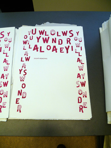
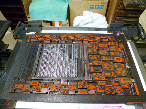
With the Edgar poem, I'd found boxes of a fabulous outline font, very carnivalesque (is that a word?), with solid letters and outline letters that could overprint, and I knew I had to find a way to use them.
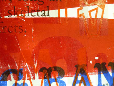
Edgar's poem is all about potential, and ability, and confidence, and strangeness, and... lots of things, but the visual image he provides is one of floating text, and the keyword for me was sunset. So my first layer was in pinky red, and then I added a second layer of orange and black:
to make:
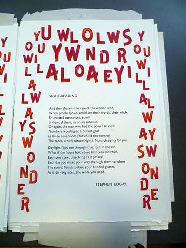
I kept thinking about whether to use found text, or to just randomly pull letters from the box and arrange them, but in the end, after wandering around holding the poem loosely in my head (which is something I do a lot, because I have a dreadful memory for words, but the sense of things lingers, especially visually), I hit upon the phrase YOU WILL ALWAYS WONDER, and I used it all through the print. I like to think that people will discover it in the print at some point, and it will extend the reading slightly.
That print wasn't a hard one to set up and print, but it was laborious, especially with the two print runs.
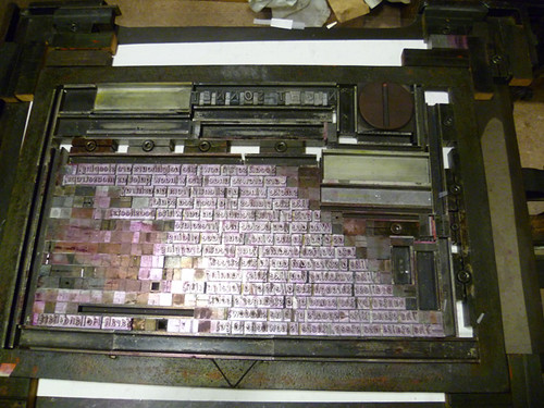
The next one, Vincent O'Sullivan's river poem (it has no title), but excruciatingly tricky. For one thing, getting the second layer of colour to work with the first was hard, as I have no scales, and can't mix colour accurately. Took me over an hour to get the colour right. And then there was the layout:

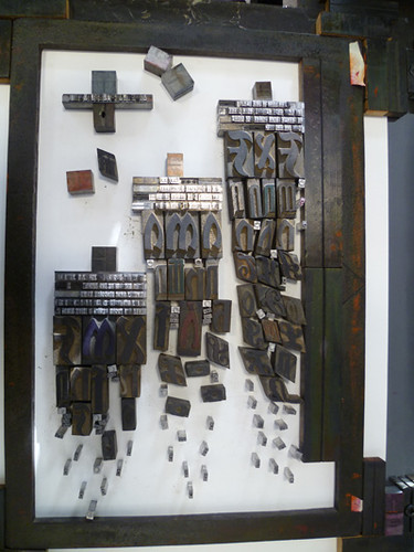
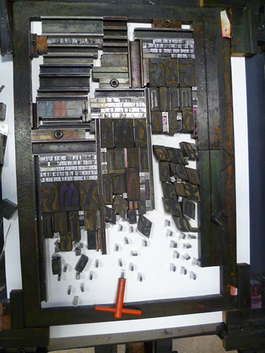
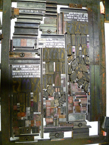
It was like doing a jigsaw puzzle. And even once I'd got it all set up, a lot of it wasn't working properly because the wood type I was using was so old and worn, it needed to be packed up a lot.
I'd hoped to get it all printed by Sunday night, but I spent Saturday faffing with it, and then I went to see the bands, and I spent the rest of the night dreaming about rolling it up. I woke up on Sunday determined to resolve it. So I mixed a stiffer ink for the text (silver and black, to make a dark silver), and I changed the layout a bit to make rolling easier, and then I rolled up my sleeves and got stuck into it.
I did finish it on Sunday night. Late Sunday night.
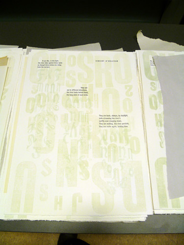
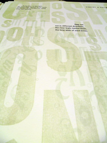
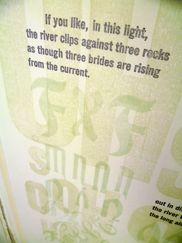
I'm happy with it. I wanted watery, I wanted elegant, plus churchy and bridal without being saccharine. I think I got there. It's very subtle, and a lot of its printing is embossed as well as inked, so you have to hold it and shift it around to get the full effect.
Then it was time to pull it all apart, make another frisket,
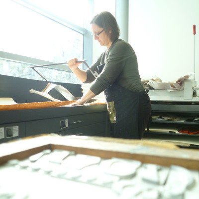
and start on another one. I gave a little taster of it this morning, because my last big post about printing was reposted on Spike the Meanjin blog, and I thought I'd better have something printy online at the top of my posts.
This poem, by Sarah Holland-Batt, has a dark, dreamy mood to it, which I wanted to convey visually. I decided to try some more freehand rolling, straight on to the paper, which gives a very velvety feel to the colour, a plum colour meant to evoke squid inkiness.
But! first I had to adjust the platen of the Columbian, which was listing rather badly to one end... I asked the magical Library Custodian (that's what they call the helping background staff: the tea ladies {yes, they also still have those}, the maintenance and cleaning people) if he had any WD-40, and lo! he did, even though no-one else, including Donald-the-Special-Collections-Librarian, knew what I was talking about.
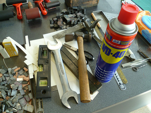
Have tools, can wrangle bolts.
I have a wonderful book, belonging to the library, about printing with the iron handpress, and it goes into a long and complicated explanation about making the platen straight that involves pressure tests with little tags of mylar etc. I don't have time for that, so I used a spirit level. It's now not perfect, but it's close to perfect and it took ten minutes.
Back to Night Sonnet.
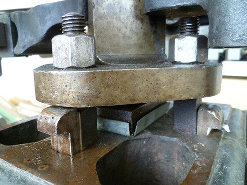
Having straightened the platen, I then try to print a forme that has an extra amount of pressure in one corner... doh. I was embossing the title and the wooden O (to make a moon) so that I could hand-roll ink over the top and make the embossing POP. Unfortunately, if I embossed hard enough to make the moon pop, everything couldn't print clearly. So I compromised, and made it a dark moon, with outlines only, which works with the surreal musing of the poem.
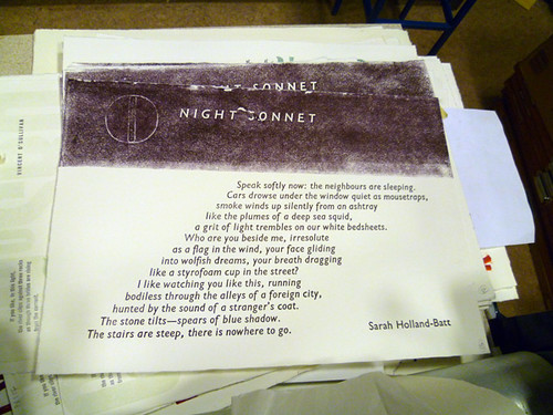
Excuse the tatty header on that example... it's what happens if the roller hasn't got enough ink on it: it gets sticky and pulls the fluffy paper apart rather than depositing ink. You only do it once (or twice).
It was such a gloriously easy print to do once I got the pressure working: one colour, good easy rolling with no overlaps on the press, a couple of strokes with the roller on the bench, and done. I got the whole edition done at a leisurely pace today, and now I'm onto poster 6.
I'll leave you with a photo and a link.
I can't believe this man could get to GG with a name like that. I wonder if he collects Hardy Boys novels?
Also: you have to see this. It's the best LOLcat link EVER.
13 comments:
I'm sure your posters will look beautiful, but what I'd love most of all is......posters of the packed wooden type. There's something so tactile about old, carved blocks that have "spoken" peoples' words for so many years.
I just fell into a reverie of you doing miracles like that with my work one day.....gorgeous.
corrrrrr! I love all the shots of the type in the forme
and such drool-worthy work!
phworrrr!
Really, really enjoying your NZ posts. All this gorgeous ink and paper and type. Wish it was possible to see one of folios when they're done.
Dear Ms Duck
This is all terrific! I ordered my set of your work a wee while ago because the Otakou Press products are always so good. And I think you are enhancing it by giving the shots of chase set ups and discussions of production issues.
In an earlier post you mentioned having the individual sheets framed etc. When you get time I'd appreciate any ideas you have on some form of framing into which sheets could be set, and removed/replaced and so on. I don't have the wall space to have them all put up framed but don't want them tucked away somewhere either.
But don't let that distract you from what is clearly a masterpiece in process.
Terry Craig
that river poem is GORGEOUS. Well they're all gorgeous really and if I had the dosh I'd buy the set... anyway, it looks as if you're having fun AND being SuperDuck. Fab!
well, that's an easy choice. Consider These Sold (well, very hopefully if there are any left by now).
My god these posts are delicious...thank you again. Will tweet them vociferously after dinner.
Hi!
I love creativity,i love design,i love photography,i love your work, and so m gonna follow you!!!
cheers!
-manish
Gosh, such a rush of nice comments! Thanks all! Gen, I think there are about 20 sets left.
Terry, framing is so personal... there are a couple in the set that probably could be 'floated' in a box frame, but another idea is to have one frame made up, and hang one poster at a time, changing them over when you get sick of it :) If you do that, make sure the frame can be hung both ways, as the orientation of the prints changes.
Ms Duck your work is beautiful and is beautiful by itself, but also makes the poems more readable which is a wonderful thing for those of us nervous about reading poetry.
And the type all set up ready to go looks so gorgeous. I'm glad you took pictures to show us.
Hi Caren. The prints are really coming along, you're motoring! You have a great view of the park in the workshop but pity about the weather we've been having. Hope you're keeping warm, not long till Spring now =)
what an informative and interesting blog with wonderful images.
where do you get the time.
i must try harder
ps
your printing is beautiful.
I love seeing the work you do--you have so much insight into how text and content intertwine. Seems like your poem settings are especially awesome.
Post a Comment