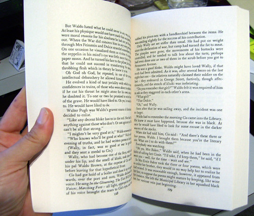
I have a solid shelf of my bookcase full of Patrick White books, and I could have sworn that I owned TSM. It wasn't there, however, so maybe it's been 'borrowed' by Colonel Duck.* Best Beloved was in the vicinity of bookshops yesterday, and he obligingly nipped in and bought me a brand new copy for only $12.95, published by Vintage/Random House. We were both quite impressed by the affordability of the re-release.
BUT! Damn, there's always a 'but', isn't there? When I opened the pages, my heart sank. Go on, have a look for yourself. Can you see why my heart sank?

It's quite obviously a photographic reprint a couple of steps removed from a hardback edition; the type is not as crisp as if it had been freshly set and reproduced from that fresh setting. But that's pretty normal for a backlist reprint.
It's the position on the page that offends me mightily. There's space up the top for a header, but there's no header. There's a page number at the bottom, quite close to the text, which is fine, as long as it was given a bit of space underneath to balance it out. THE TEXTBLOCK IS SLIPPING OFF THE PAGE!
Sheer ignorance or utter neglect, is what I call this reprint. If they'd just hoiked it UP the page a bit (not so hard to do), it would sit comfortably in the space. But instead I'm going to read it with a sense that if it came out in the sun with me, all the words would run down off the paper and all over my hand. And that's going to be a bit distracting.
Boo sucks, Random House. Your design department needs to care a little bit more, or hire someone who knows about the (elementary) dynamics of white space.
There. I feel better now. I can finally start reading.
*Old family joke. Heh.
9 comments:
Intergenerational borrowing of books is rife in my family too.
Got your gorgeous card this morning - how excitement!!! Will email you directly.
Yairs, it IS a bit of a hungry gutter.
My pleasure. I'm sure there will be some nice oldish Penguins out there somewhere.
Here's hoping for you. I have a copy of a Hunter S Thompson book I'd love to read, but it's so badly printed I've never been able to. No space in the gutter at all, and really small, yucky font.
Don't even get me started on people who print etchings in the middle of the paper, or god forbid, below it. Despicable.
That's right, Fluffy! There should always be more white space below than above; it provides visual balance. This applies when framing things too.
(And the edges of your etching plate should be clean, but that's another thing altogether.)
Thank goodness there are other people like me who can't read or cook if the printing isn't just right. I hate any kind of red writing in a cook book. I love glossy pages though.
Like you &D, I was pleased to find a new copy for such a good price and to be honest I was also happy that the print was larger than my copy of the Vivisector! On second glance though I agree, it's a bit of a mess inside. Still, sometimes I like to have a book that I can't be TOO precious about, especially if I intend to carry it around with me. I guess that's why I like to have several copies of my faves.
I've started writing little notes in pencil along that top bit, so it's come in quite handy! Still ugly, but.
yes I went to the next copy on the shelf to see if it was a one off mistake. But I ended up paying $24.95 at Borders!
Post a Comment